Context
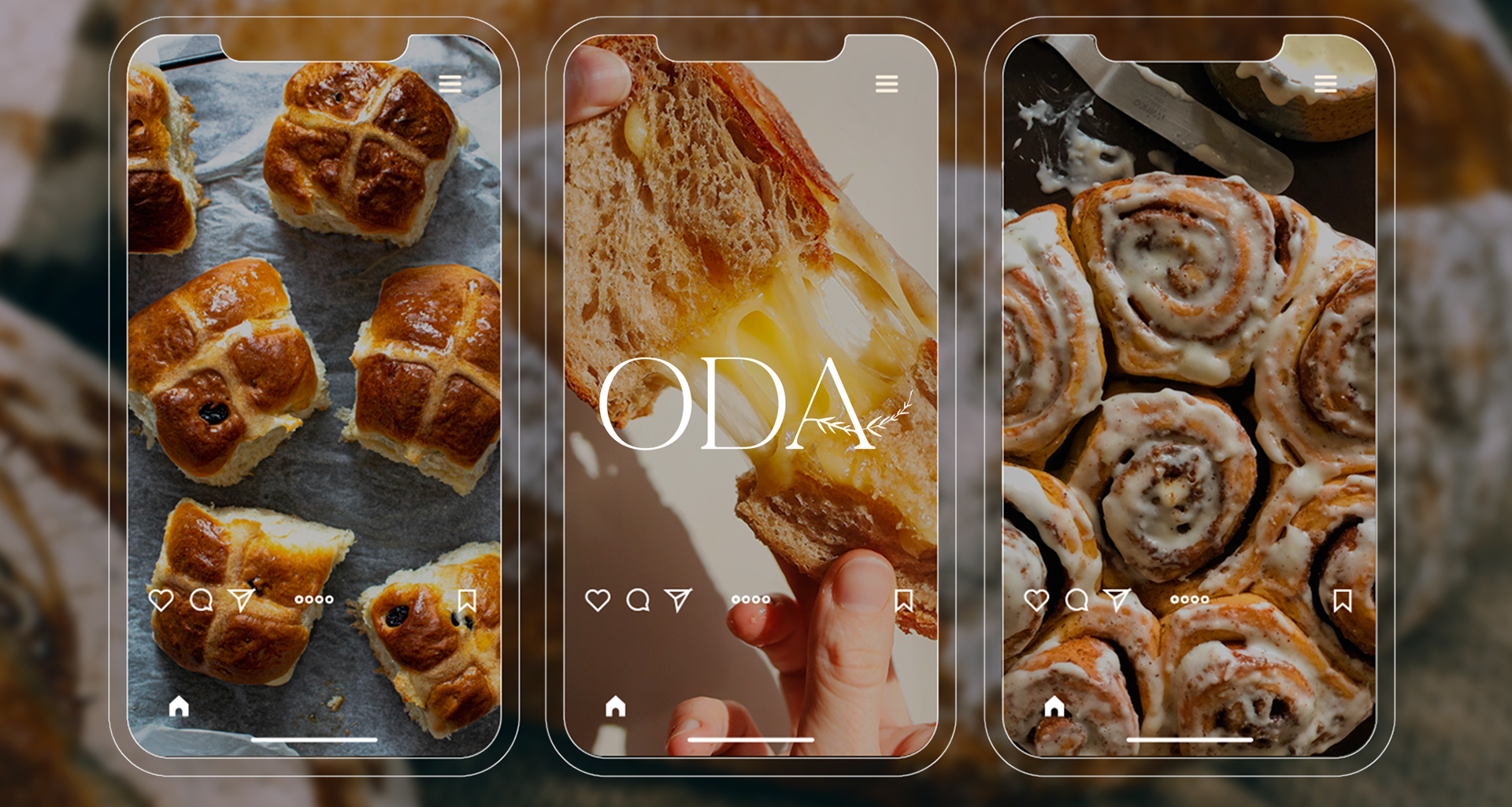
Oda al Pan is a company rooted in traditional Mexican baking, aiming to reinterpret classic flavors and techniques for a modern audience. The brand values authenticity, artisanal quality, and a deep respect for tradition, while appealing to contemporary market expectations.
🛠️ Task
Develop a comprehensive brand identity that communicates the essence of the company by blending tradition and modernity. This included the creation of the brand name, as well as the development of a visual identity—designing a logo and selecting appropriate typography. The goal was to evoke the artisanal and authentic character of the brand while positioning it for a sophisticated, contemporary market.
✅ Result
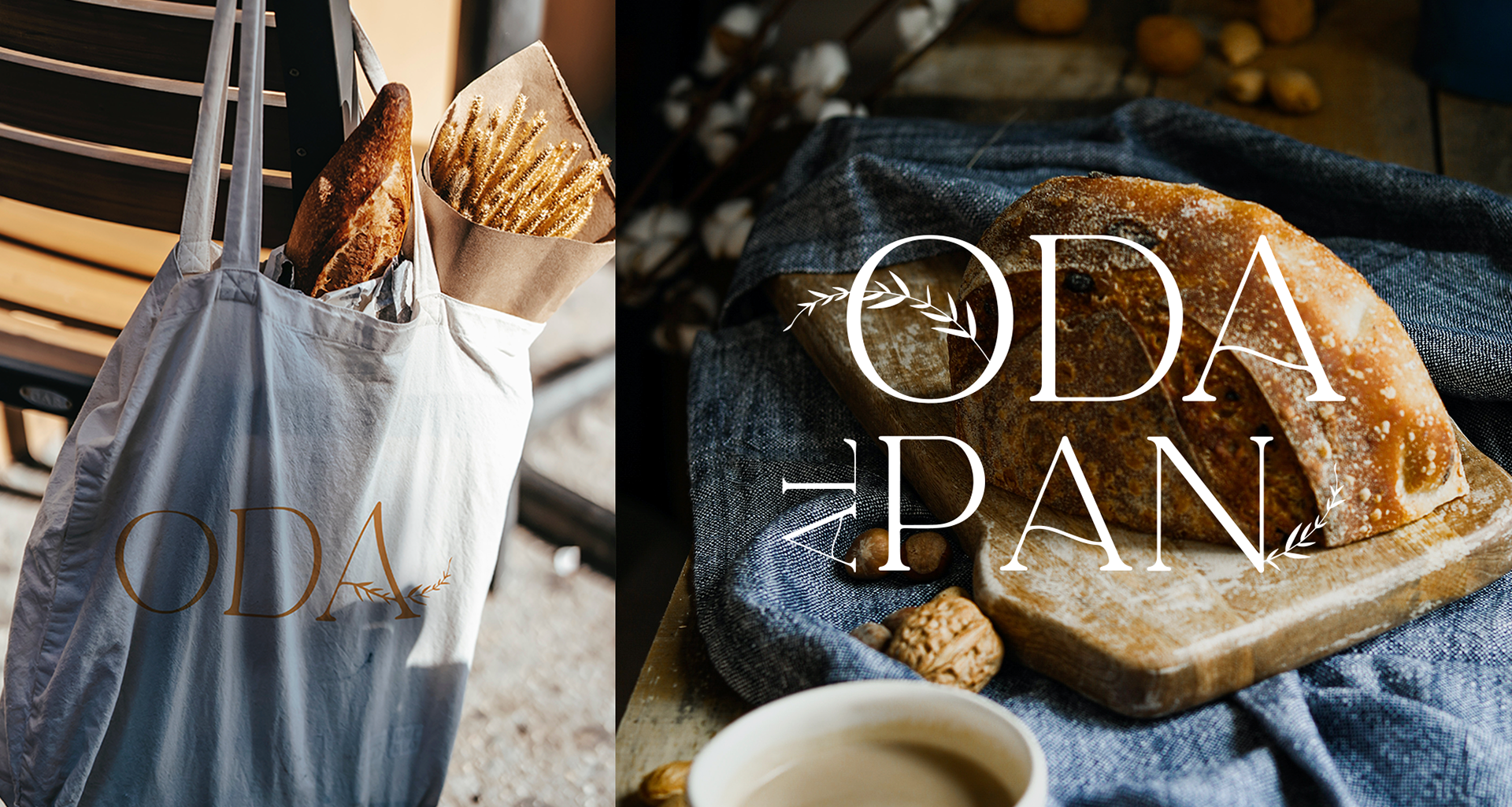
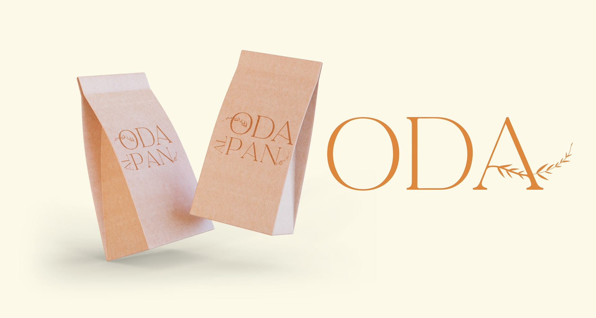
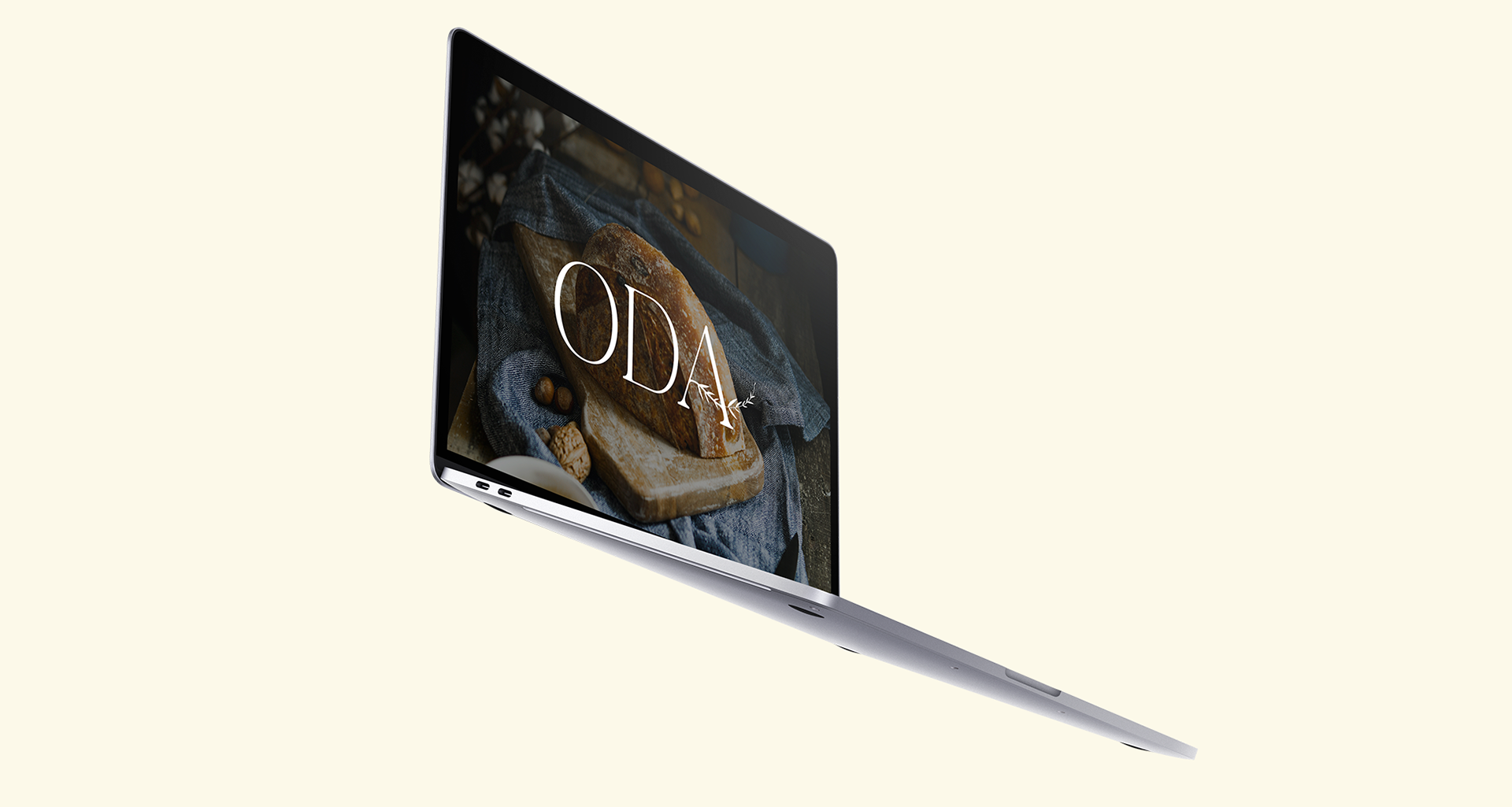
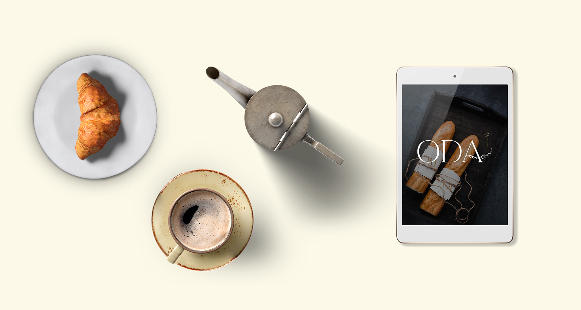
We created the name “Oda al Pan” (“Ode to Bread”), which poetically honors the central role of bread in Mexican culinary tradition. The visual identity features a wheat stalk logo, symbolizing both the quality of ingredients and respect for traditional processes. The typography chosen is simple yet elegant, with soft, balanced lines that reflect the care and delicacy with which each piece of bread is made. Altogether, these elements form a timeless and evocative brand image that bridges nostalgic, homemade flavors with a fresh, refined proposal for today’s market.